From Discovery & User Research to a Working Beta in 2 Months
- Role
- Co-founder, Founding UX/UI Designer
- Timeline
- May 2026 to present
- Skills
- Product Design, User Research, EdTech Founder
- Team
- 1 designer + 1 engineer
Overview
As Co-founder and Founding UX/UI Designer, I led Folio from discovery to a live beta: a distraction-free writing space that helps language learners produce language, not just consume it. Most apps stop at flashcards and quizzes, so intermediate learners still juggle translators mid-sentence and lose their flow. I ran research with learners and educators, then designed an experience with inline translation, contextual vocabulary, and progress tracking so writing stays in one place. Partnering with engineer Mark Baula and Velocity's Cornerstone Program, we shipped folioapp.ca in two months, now supporting 160+ languages.
Table of contents
The team and my role
The team consisted of myself as Co-founder and Founding UX/UI Designer, and Mark Baula as founding engineer. I owned product design and user research end to end, from the first interviews through final UI, while Mark built out the core functionality in parallel. As a two-person team, we worked closely and iterated fast, with weekly check-ins to align design decisions against what was technically feasible to ship in two months.
Research
User interviews
Before opening Figma, I conducted 6 user interviews using the Mom Test framework, a research method that keeps interviews grounded in real behavior instead of opinion. Rather than asking “would you use my app,” I asked what apps people were already using, what worked, and what didn't, and followed up closely to understand their existing workflows, frustrations, and wishes. I recruited independent learners ranging from complete beginners to B2 level, studying French, Spanish, Arabic, Mandarin, and Japanese, along with a university French professor with over twenty years of teaching experience for an educator's perspective. Two questions gave me the richest answers every time: “What's one thing you wish someone had already solved about language learning?” and “If you could describe your ideal language learning tool to a friend, what would it have?”
Understanding the findings
Scattered information doesn't reveal patterns. Good UX comes from synthesizing the common themes across interviews and spotting where the opportunity actually is. After going through all 6 conversations, I distilled four core themes:
Relying on multiple tools disrupts learning flow (5 of 5 participants)
Everyone used multiple apps in a single practice session, and switching mid-task broke their concentration, often ending the session entirely.
Without real-life context, it's hard to remember vocabulary (5 of 5 participants)
Word lists don't stick. The vocabulary that stuck best was learned through situations that were personally meaningful.
Existing apps get repetitive and stop challenging users (4 of 5 participants)
Duolingo came up constantly, always negatively. Users start strong, enjoy the early structure, then plateau because the app doesn't grow with them.
Without using an app, it's hard to track and share growth (3 of 5 participants)
Self-learners felt isolated. The ones with a tutor or language partner were far more consistent, and the ones without wished for accountability and community.
Product positioning
Before the interviews, I assumed Folio was for anyone learning a language. The research challenged that assumption. I repositioned the product around intermediate learners who've already built a foundation and want to produce language, not just consume it. That's what makes a product stand out: knowing exactly who it's for instead of trying to serve everyone. I defined four target personas:
- International students writing assignments and emails in a second language
- Professionals communicating under real workplace pressure
- Bilingual individuals trying to express more personal or complex ideas with friends and family
- Intermediate learners who consume plenty of content but rarely practice writing themselves
Feature prioritization
To determine what to build, I mapped the research themes directly onto feature priorities. Every feature had to justify itself against the same question: does this remove friction, or add it? If the answer was no, it didn't make the product. That's how I defined and designed:
- An inline translation shortcut, typing
//mid-sentence to translate without leaving the page - Daily writing prompts tailored to CEFR proficiency levels, adjustable in difficulty
- Auto-saved vocabulary that turns into flashcards without extra effort
- A progress tracker showing words written, vocabulary learned, writing frequency, and translation use
Proof of concept
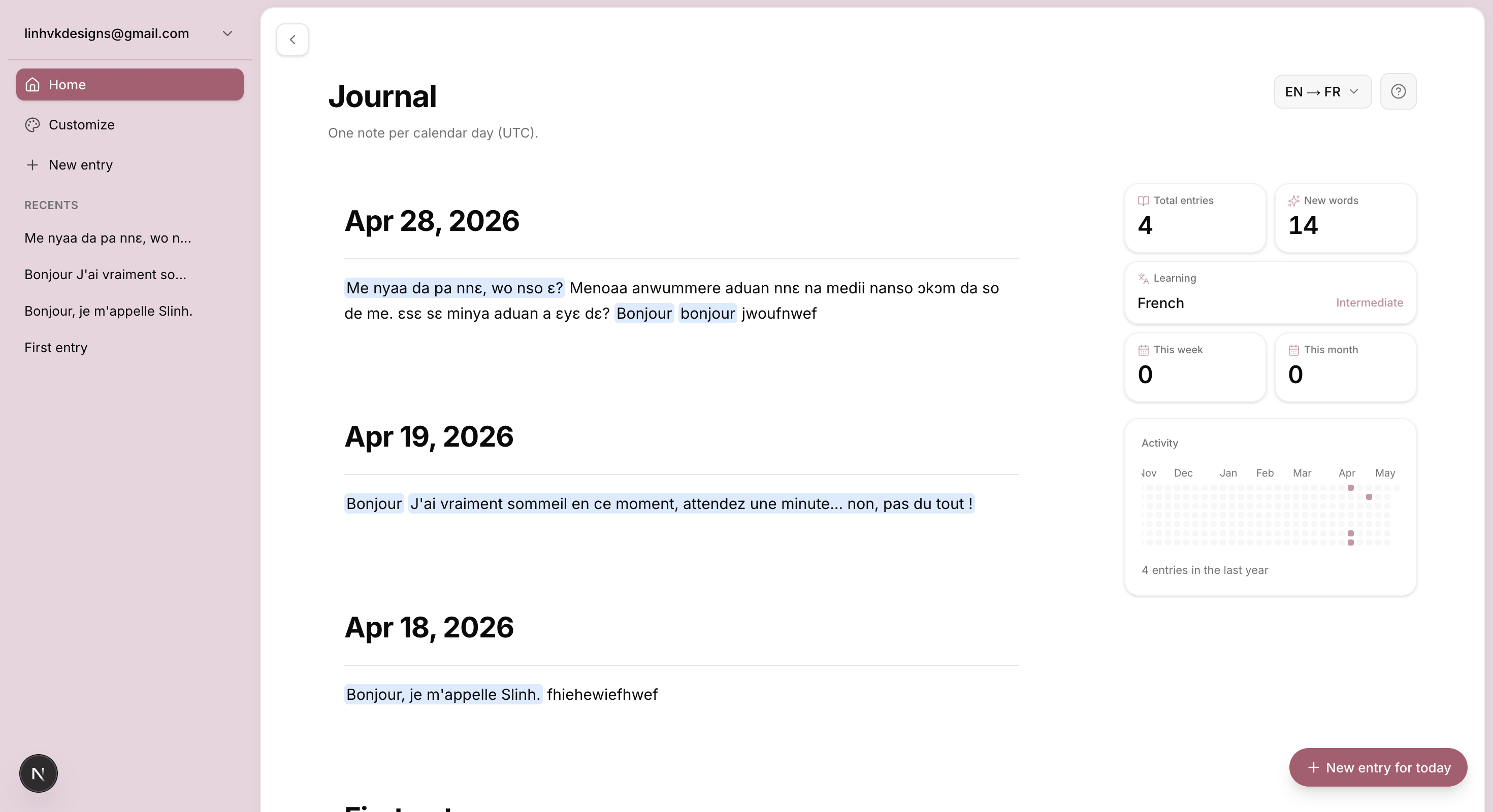
Once the direction was clear, it was time to build. I led the design of the initial proof of concept while Mark made sure the core functionality worked before worrying about polish. This is the stage where the idea stops being a plan and becomes something people can actually click through.
User testing and reiteration
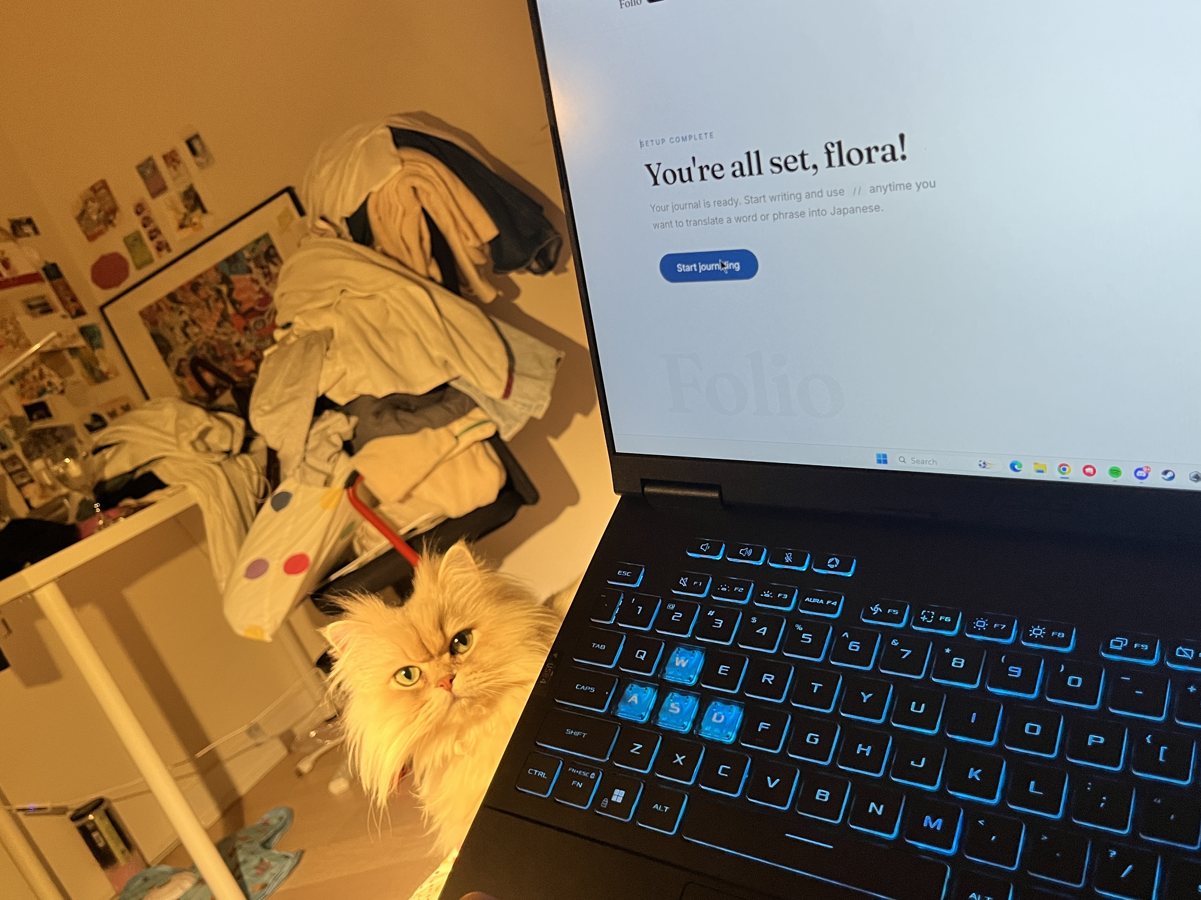
Run user testing early, and rapidly modify features based on what you see. I recruited two of the original interview participants back to test the working prototype, then ran additional beta testing sessions, specifically evaluating the number of clicks it took to do anything and whether the instructions were clear enough to use without explanation.
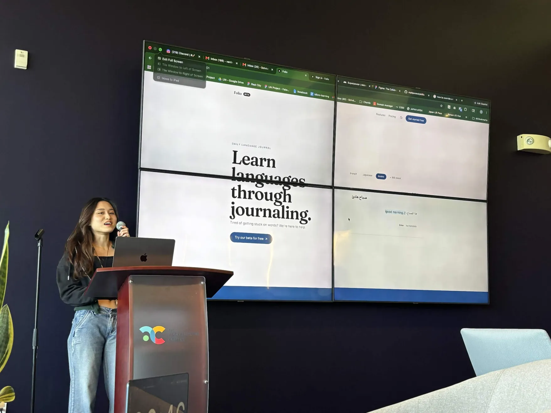
Testing revealed:
- The inline translation shortcut wasn't discoverable without someone explaining it first
- Starting a new writing session required too many clicks
- Even though users were impressed by the inline translation itself, the overall experience wasn't intuitive or fun to use
From there, I rapidly iterated, making the interface progressively simpler with every round:
- Redesigned onboarding to introduce the inline translation immediately
- Moved the entry area front and center as soon as users log in
- Strengthened Folio's branding with more personality
- Moved saved entries below the writing space to reduce distraction
- Removed the side panel layout entirely to spotlight the three core features: write, practice, progress
- Added editable journal entries after users said they wanted to revisit unfinished thoughts instead of starting over every time
Final product
After those rounds of iteration, the four core features came together into a single writing flow: write, translate, practice, and progress. After multiple rounds of iteration, GitHub PRs, and feedback prioritization, I shipped the beta, now live at folioapp.ca, supporting 160+ languages, with translation accuracy still being refined for the languages we support.
What I Learned
Leading Folio from research to launch taught me that good UX comes from removing the friction that stops people from doing what they already want to do. And the clarity for what to remove only comes from listening before you build.
Latest Projects