From 62 to 170+ Cities: Scaling a Global Data Platform
- Role
- UX/UI Designer
- Timeline
- Shipped 2026
- Skills
- Data Visualization, Accessibility, Civic Tech
- Team
- Team of 20, engineers, PM, designers, and researchers
TL;DR
Designed a global Quality of Life data platform that grew city adoption from 62 to 170+ cities and helped secure $20M in pro bono support. Built WCAG 2.1 AA accessible visualizations, a 200+ component design system, and clearer onboarding so city officials could explore complex urban data and make policy decisions at scale within a 6-month timeline.
Overview
UN-Habitat collects Quality of Life data from cities around the world. But having the data wasn't the real problem. With hundreds of indicators across multiple domains, it was hard for anyone to actually understand how a city was doing.
I joined as the UX/UI Designer on the Quality of Life Initiative Innovation team. My job was to take all that complexity and turn it into something people could explore and understand. What started as a 62-city pilot became a platform serving 170+ cities globally by early 2025.
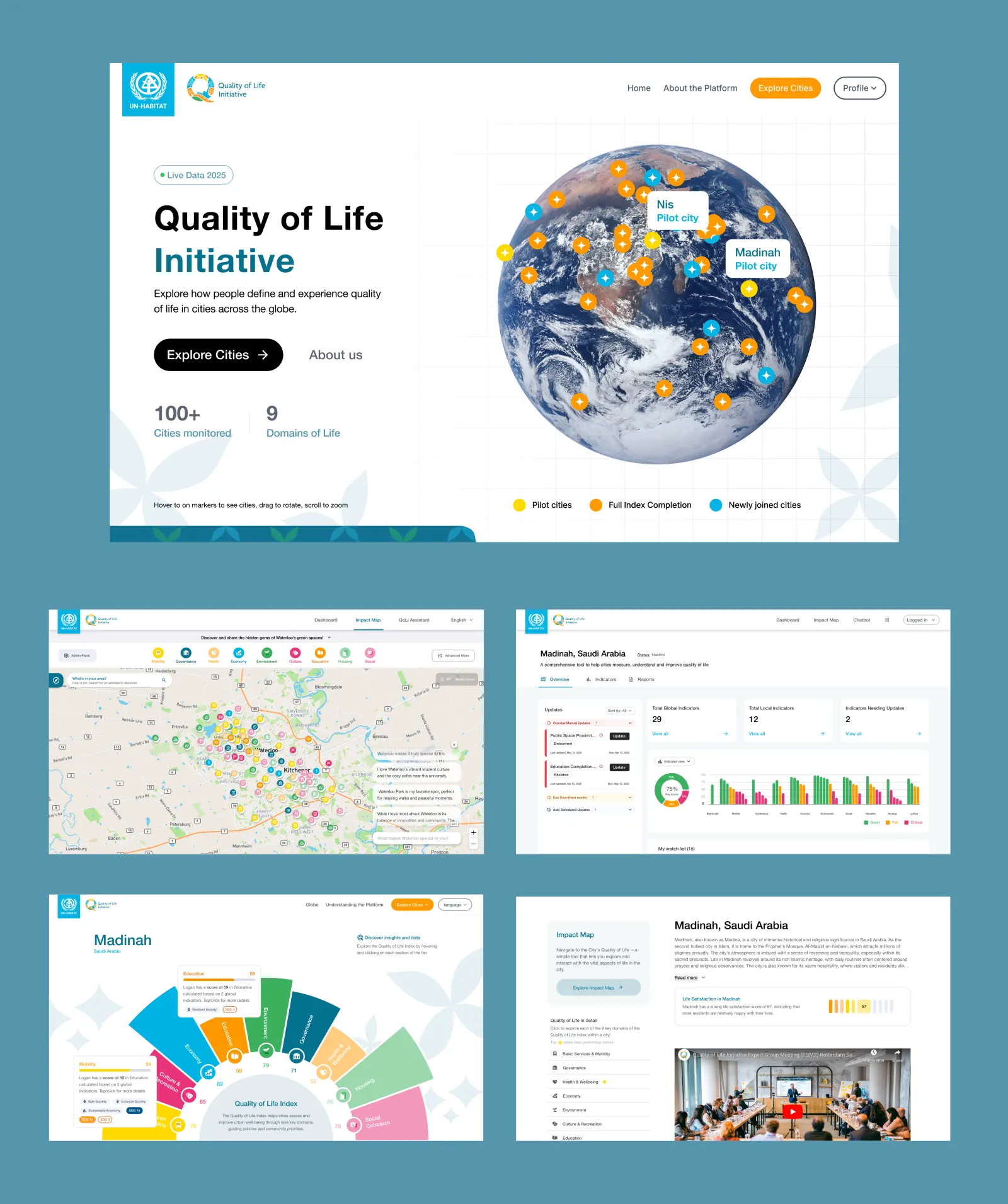
Table of contents
The Challenge
Government officials wanted to identify strengths and weaknesses in their cities. Researchers wanted to compare cities against each other. But everyone hit the same wall: where do you even start with this much information?
There was a business constraint too. The initiative needed to reach 100+ cities within 6 months or lose funding approval. That meant we didn't just need a better interface. We needed to understand how to make the platform easy to use and adopt.
“How do we make complex urban data clear enough that city officials can make policy decisions, and easy enough to onboard new cities at scale?”
The Team and My Role
I worked on a 20-person team that included engineers, a product manager, researchers, and fellow designers. My scope was broad. I owned end-to-end design for the public-facing platform: the core data visualization, admin workflows, landing page, and survey app. I also built a design system to support rapid iteration without slowing down engineering.
The tight timeline was actually our advantage. With 6 months to ship and a scaling target, I had to make every design decision defensible to our research and engineering teams. That meant validating assumptions quickly, keeping handoff clean, and staying flexible when we hit constraints.
I worked closely with data researchers at the UN to ground every decision in real user feedback. And I worked with engineers to make sure everything was feasible within our timeline.
Key Work
Building the Design System to Unblock Velocity
Before we could scale, we needed design to be repeatable. I built a 200+ component library covering data visualization patterns, form workflows, admin interfaces, and responsive layouts across mobile, tablet, and desktop.
The impact was direct. Design-to-development handoff time dropped by 50%. That freed engineering to validate features with real cities instead of waiting for specs. This velocity became the foundation for everything else we shipped.
Designing the Core Data Experience
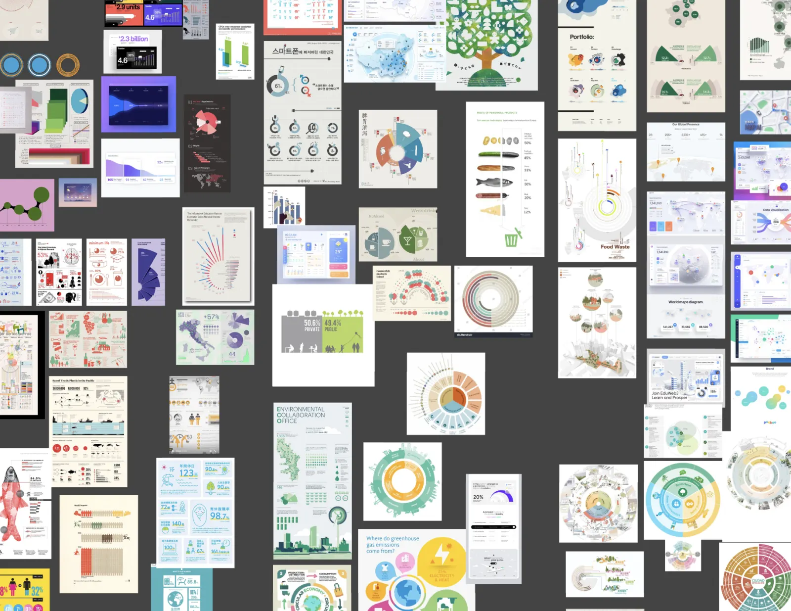
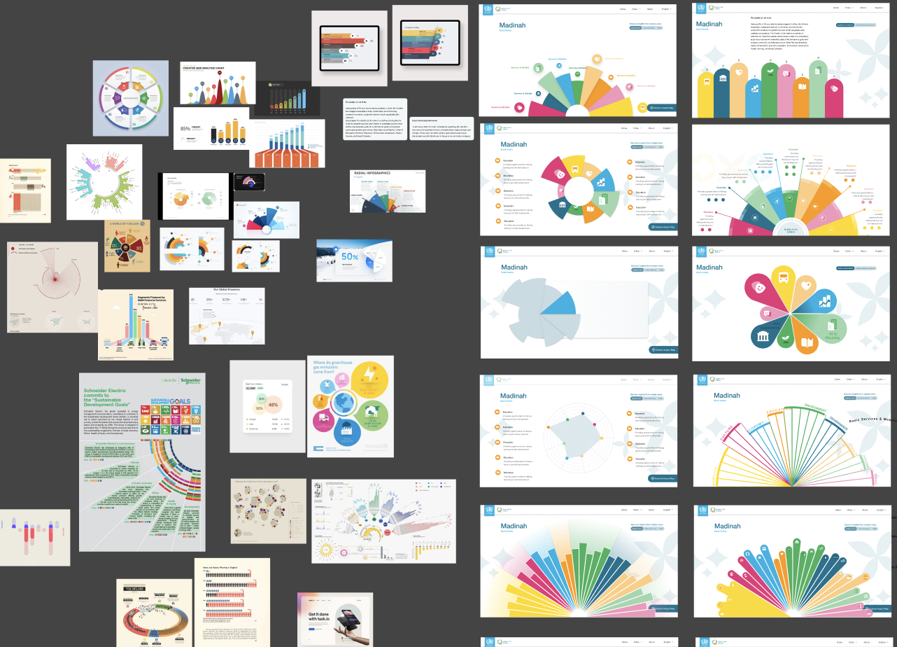
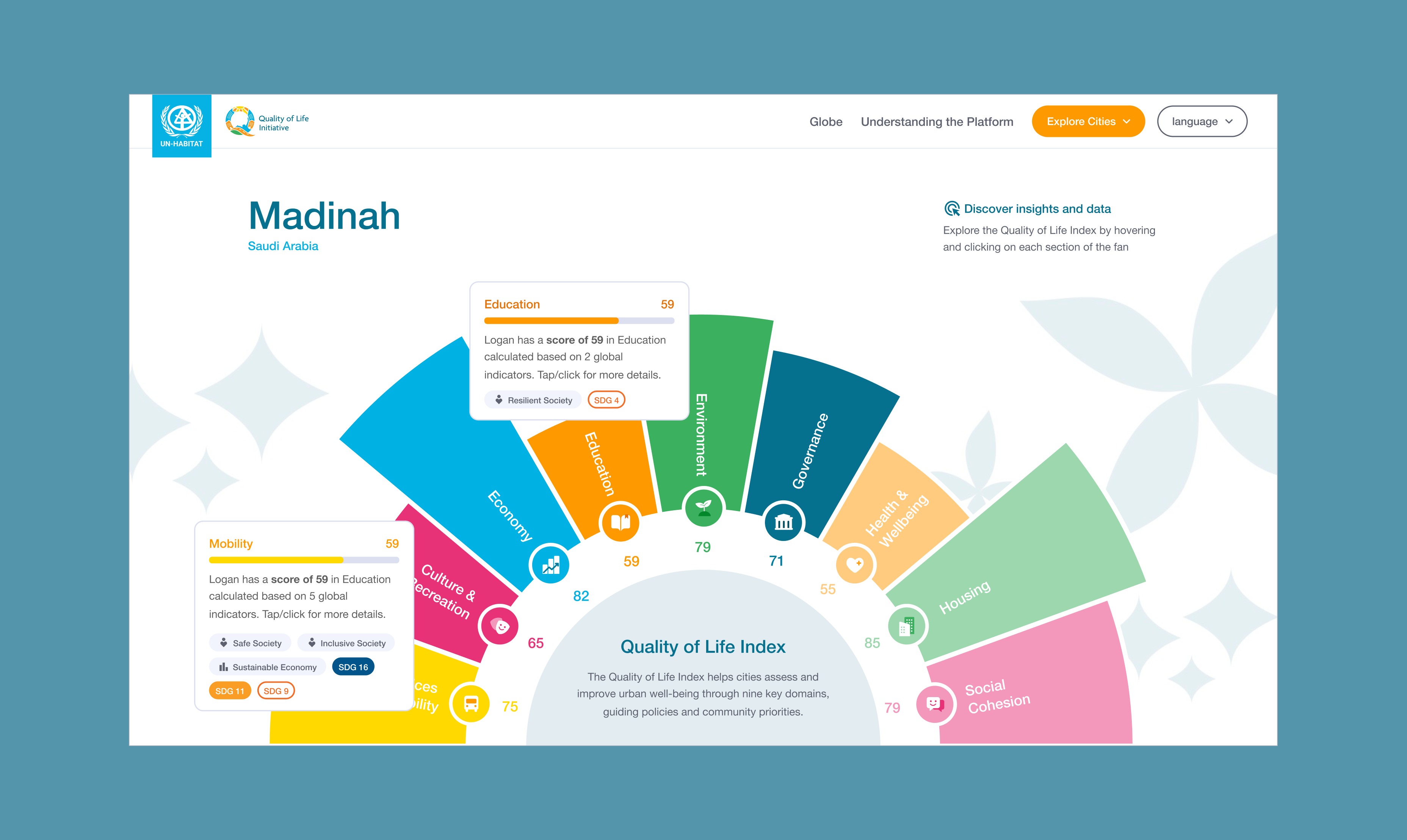
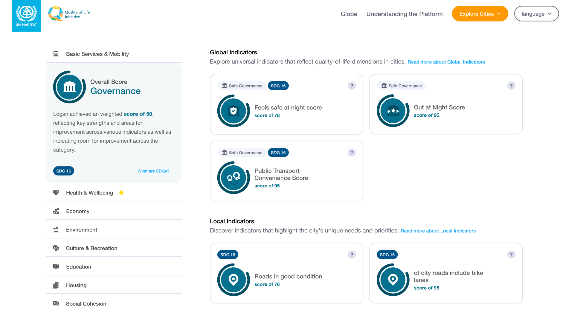
The core purpose of the platform was to give users a cohesive view of the data, not just a dump of numbers. I explored a wide range of visualization types before landing on a half sunburst fan chart to represent the nine domains making up a city's quality of life.
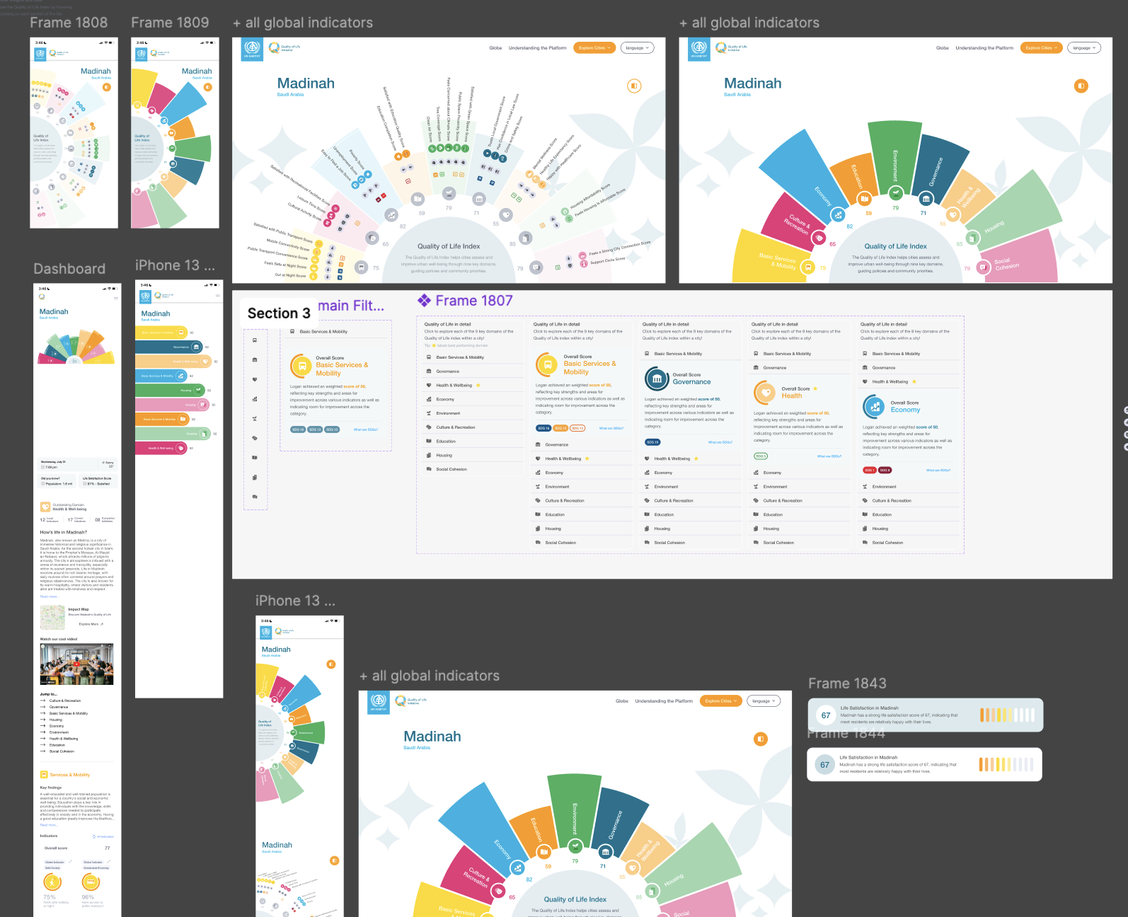
The key insight was progressive disclosure. Detailed information only appeared on hover. This approach kept the visual clean while letting users drill into relationships between domains, indicators, and the UN's Sustainable Development Goals when they wanted that level of detail.
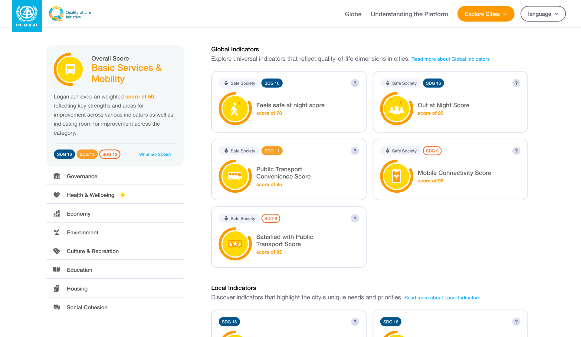
For the indicator-level data, I carried the same principle through. Each indicator's detail stayed hidden until a user asked for it. The layout followed a clear hierarchy: city, instructions, data visualization, detail. Users always knew where they were and what to do next.
Redesigning the Landing Page to Drive First Impressions
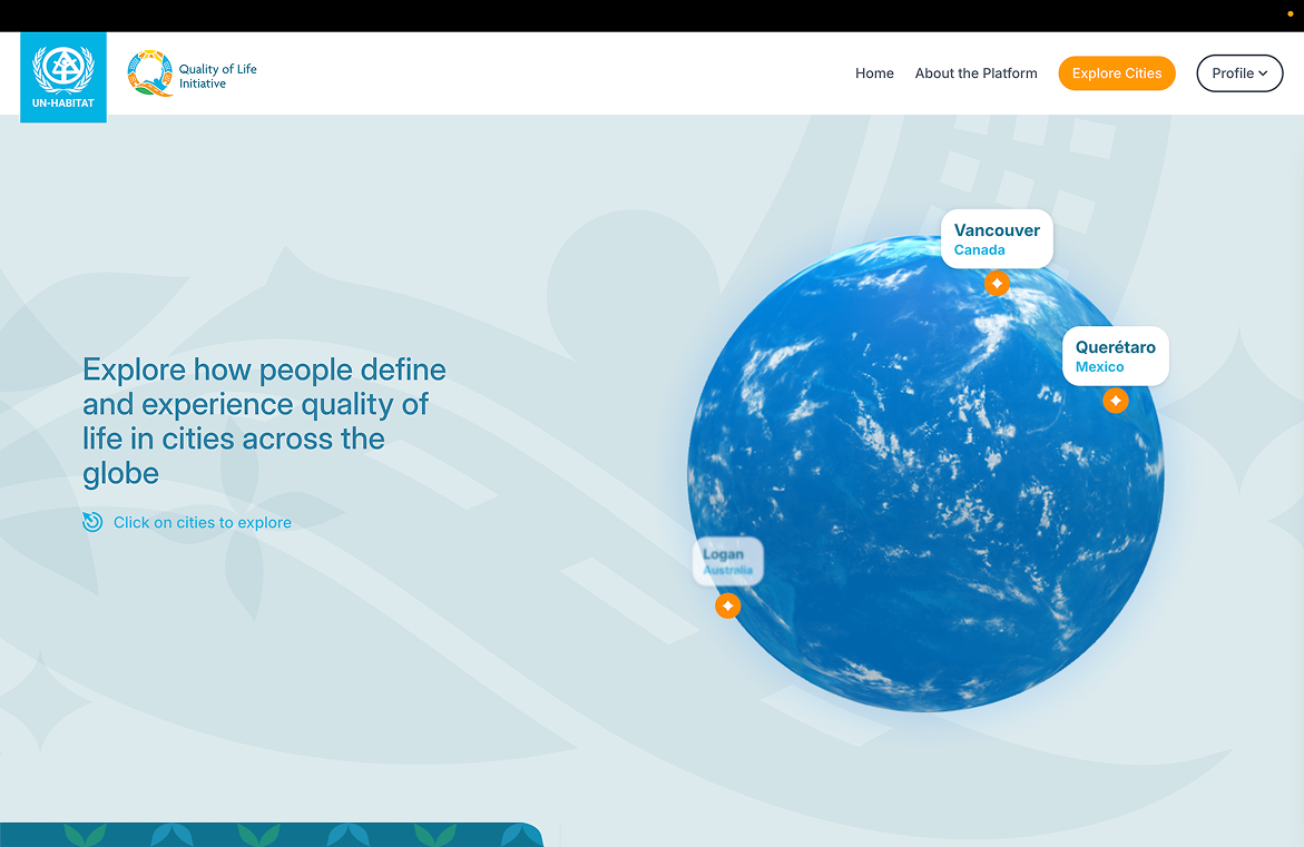
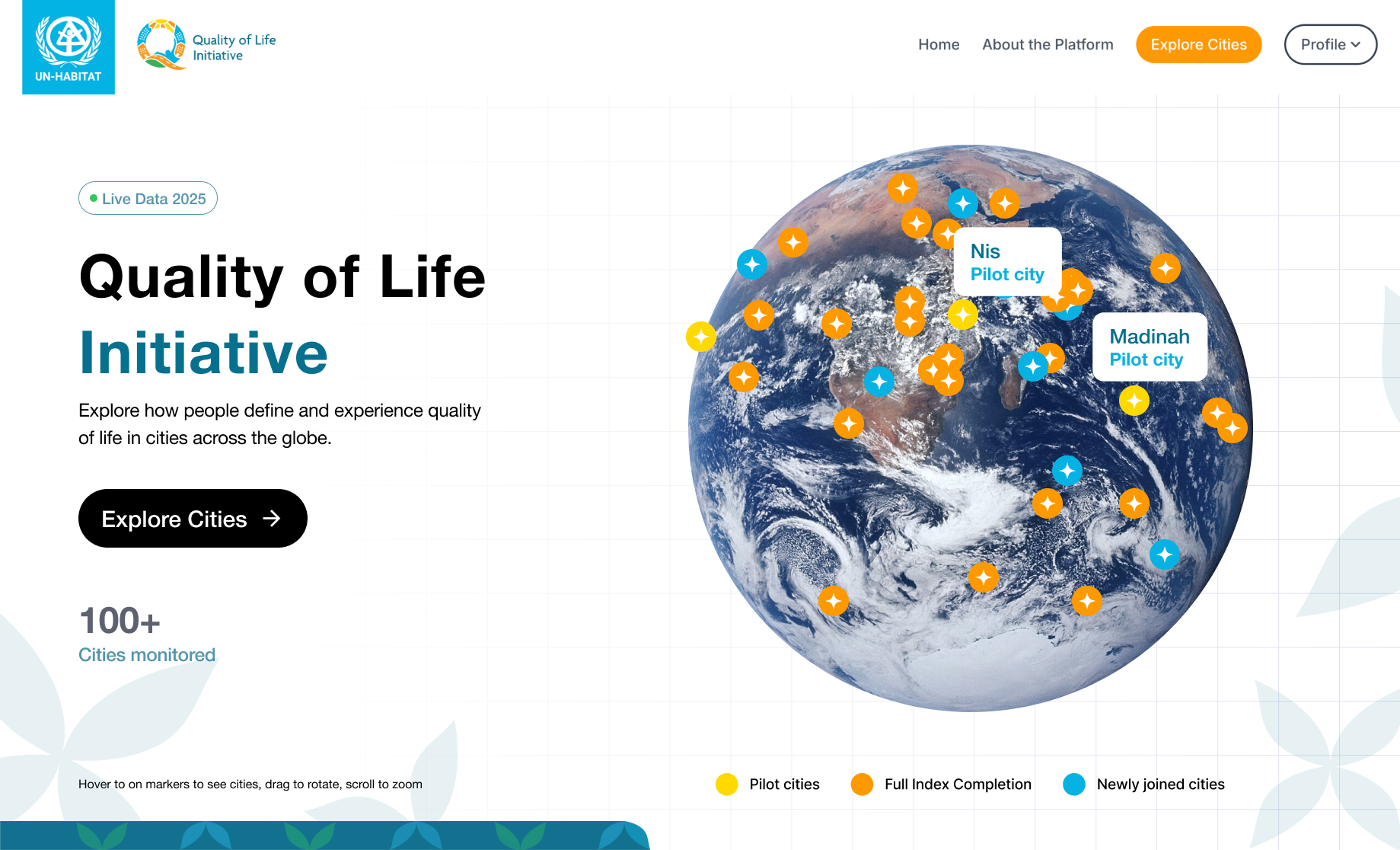
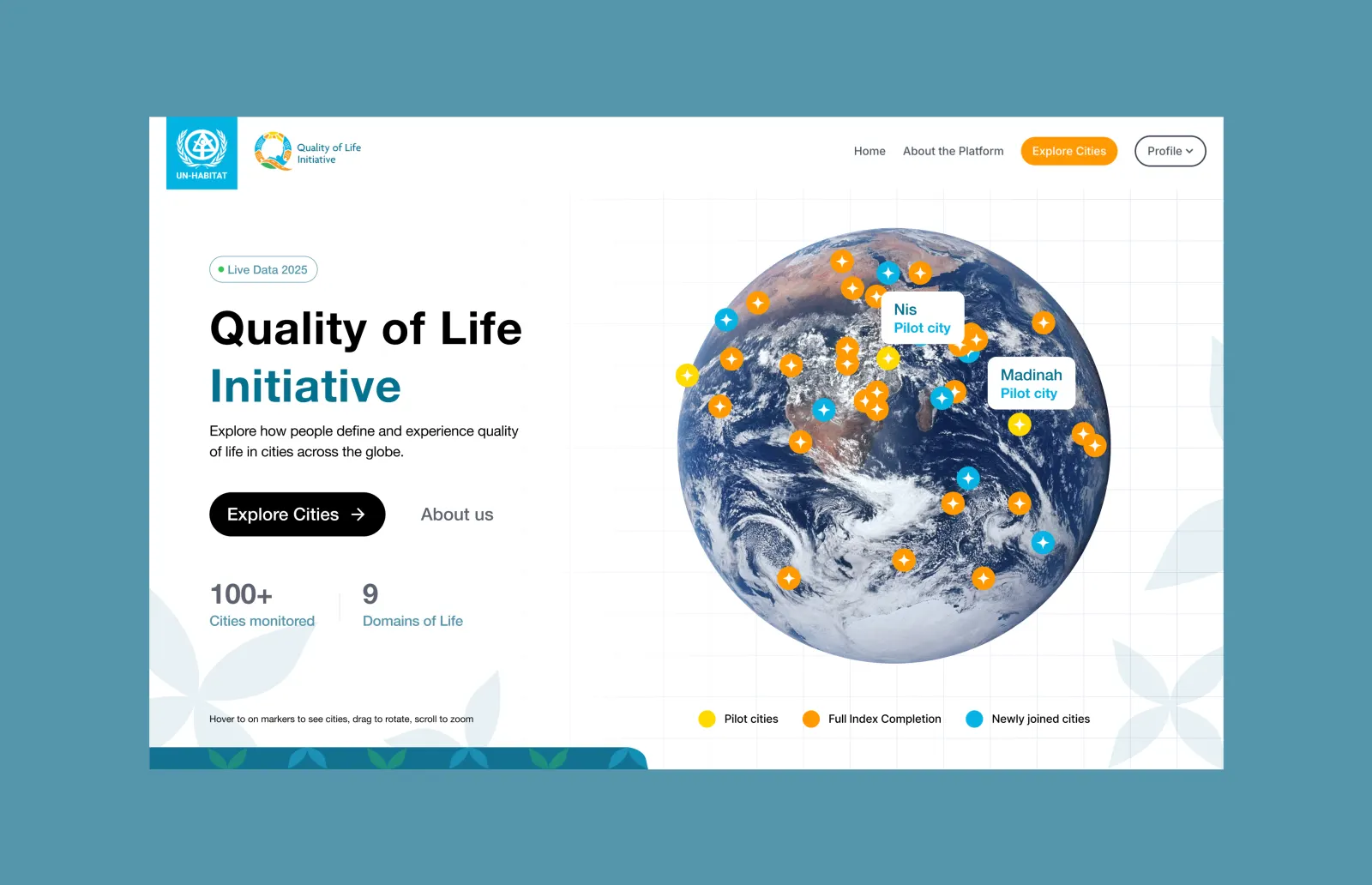
The first version had no clear call to action. City dots were color coded but unlabeled. Users had no idea what they were looking at. I ran interviews with a city admin from Logan, Australia and one from Vancouver, Canada. Both hit the same gaps. Nothing told them what to do next, and the visual had no context.
The redesign added a clear CTA, labeled the city dots, simplified the branding so it stopped competing with the content, and added credibility signals like “170+ cities monitored.” Users got immediate proof of scale before exploring further.
Designing Admin Onboarding and Permissions
Interviews with city administrators revealed three blockers. They didn't understand what the platform was for before being asked to do work. Data entry workflows felt risky. The permissions flow was confusing.
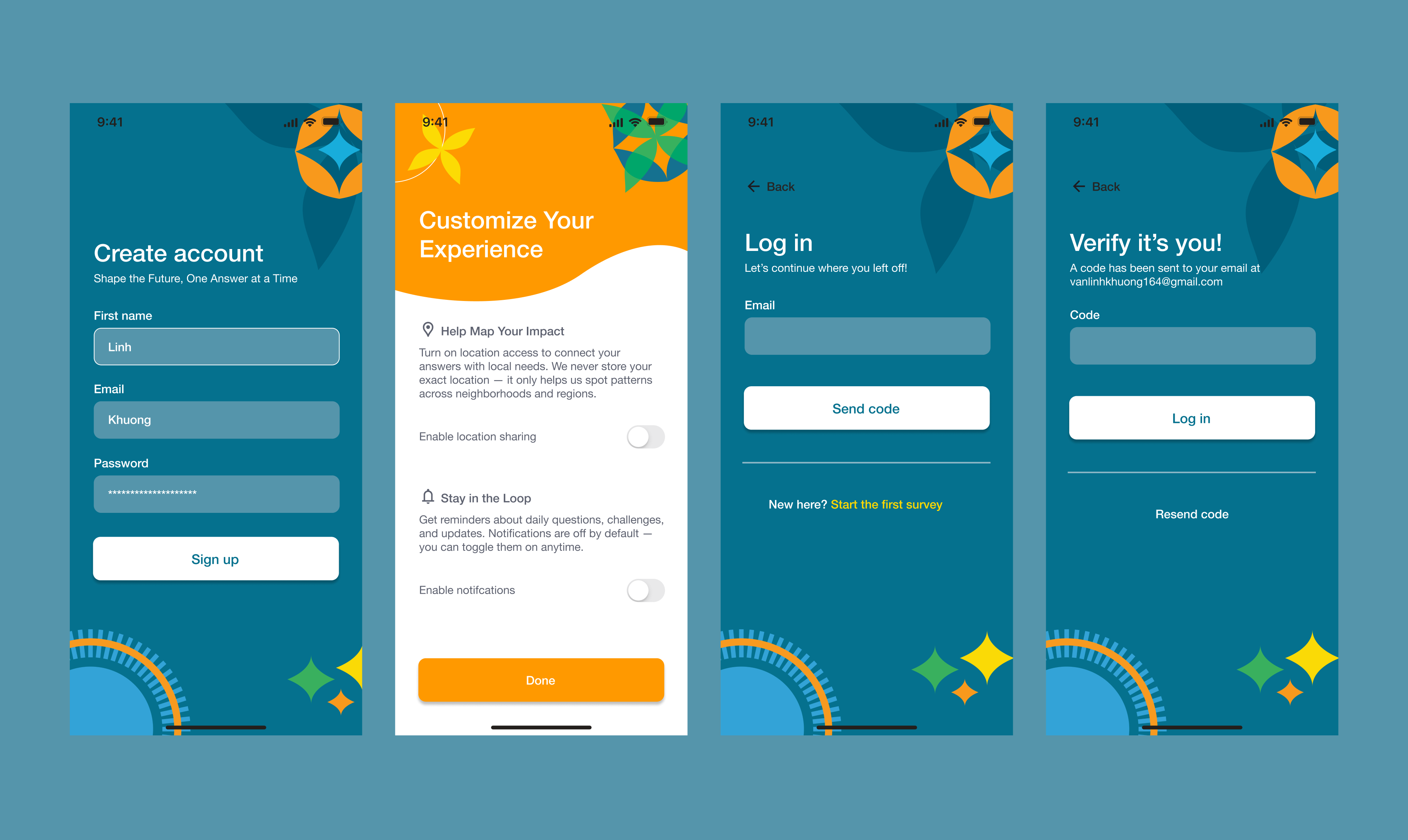
I redesigned onboarding around purpose first. Show the value and use case before asking for input. I designed the permissions flow so users could see clearly what they were being asked to grant and why. For location sharing and notifications, I made the stakes obvious.
Within 6 months, adoption grew from 62 to 170+ cities. That's 174% growth.
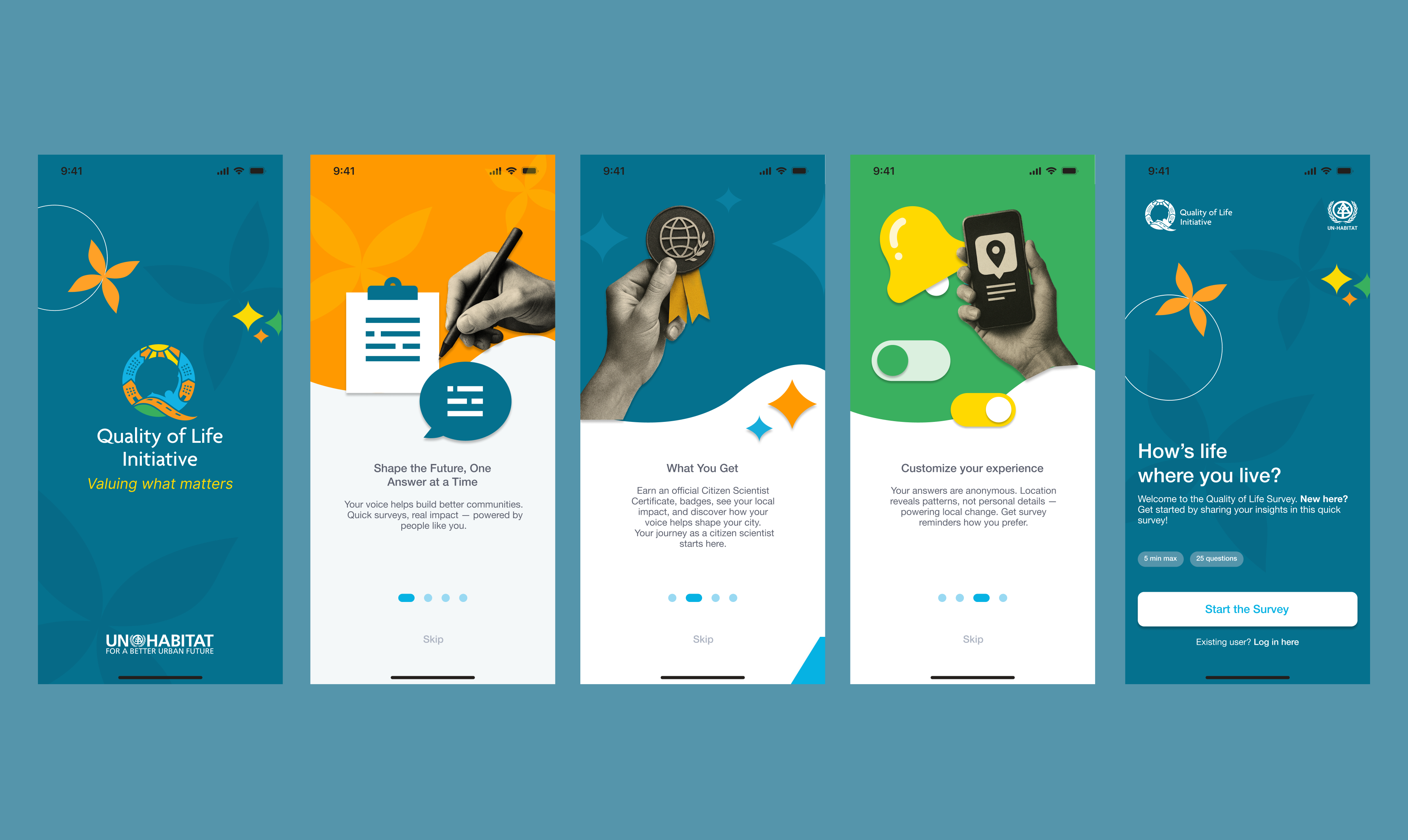
Building the Survey App for Direct Community Input
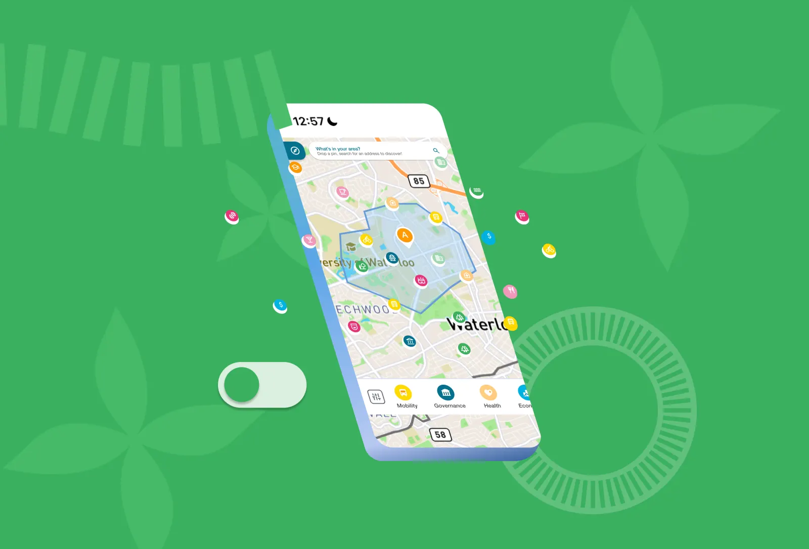
The survey app exists to let the Initiative gather data directly from people living in these cities, rather than relying only on institutional sources. I designed the onboarding flow to first explain what the app is and why it's collecting their input. People understood the purpose before being asked for anything.
The permissions flow followed the same clarity principle. Location sharing, notification enabling. Users could see what they were being asked to grant and why.
Designing Accessible Data Visualizations for Government Procurement
Government adoption requires accessibility compliance. I designed all data visualizations with WCAG 2.1 AA compliance built in from the start. That meant using color contrast, clear hierarchy, and keyboard navigation not as afterthoughts, but as core to how the experience worked.
Accessibility wasn't a feature to add later. It was often what determined whether a city could actually approve and deploy the platform.
What I Learned
Designing at government scale changed how I think about product design. I learned that accessibility isn't a feature you add later. It's often what determines whether your users can actually adopt and deploy what you've built. Every product designer should carry this into their work.
I also learned that velocity and design rigor can go hand in hand. By building the design system early, design decisions didn't become a bottleneck for engineering. The constraint of a 6-month timeline forced us to prioritize ruthlessly. That discipline made us faster, not slower.
And something more subtle: when you're designing for government adoption, you're not designing for delight. You're designing for clarity and trust. The 174% adoption spike didn't come from beautiful visualizations. It came from unglamorous UX. Clear onboarding. Honest permissions flows. An obvious value prop. Sometimes the best design is invisible because it just works.
This work shifted how I think about impact. A beautiful visualization is nice. But a visualization that helps city officials make policy decisions and shape public policy. That's design that moves the needle.
Latest Projects