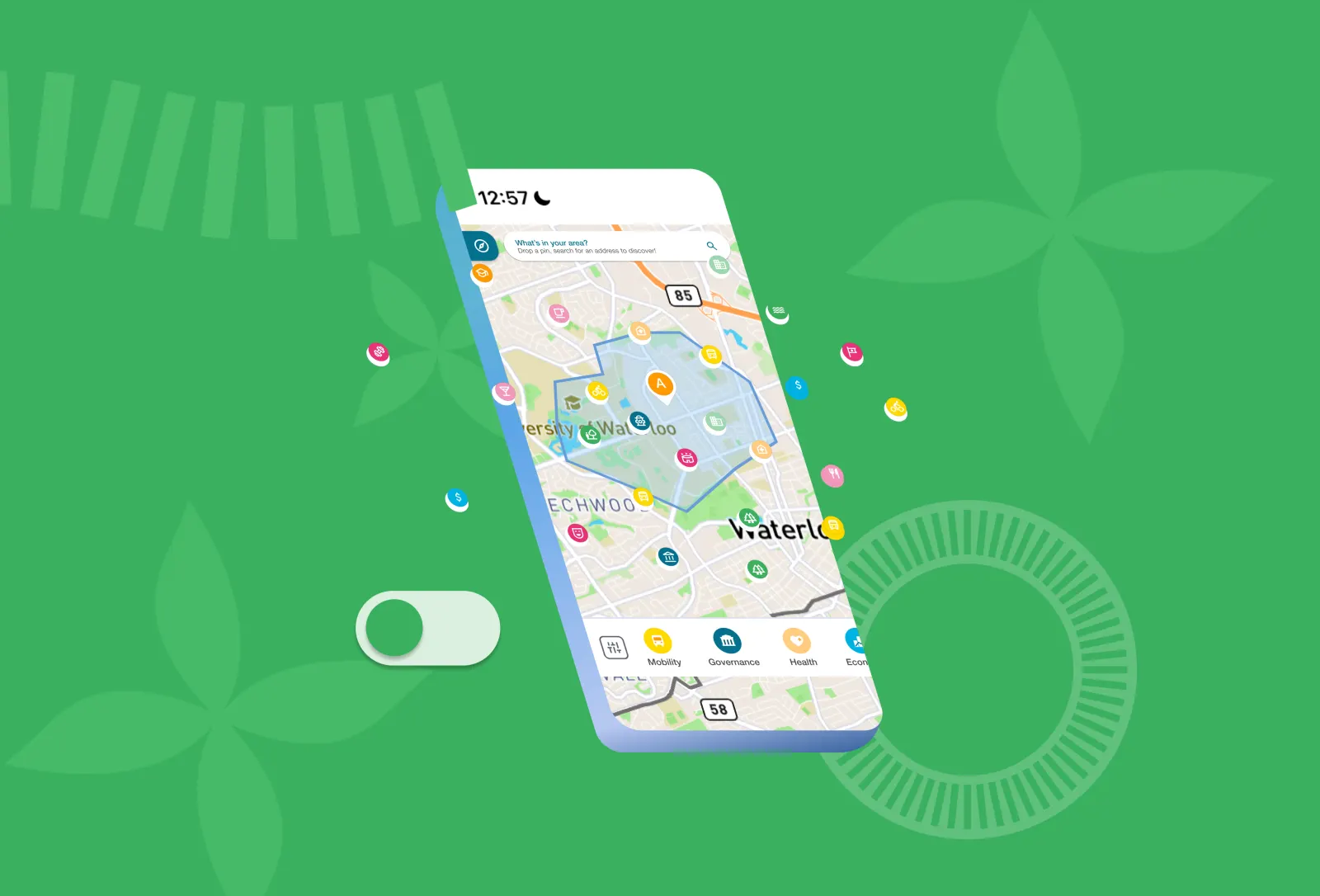
Creating a Scalable Icon System for Quality of Life Domains
- Role
- UX/UI Designer
- Timeline
- Shipped 2026
- Skills
- Design Systems, Accessibility, Design Ops
- Team
- Team of 20: engineers, PM, designers, and researchers
TL;DR
Built a 200+ component design system that unified buttons, spacing, color, iconography, and interaction patterns across a growing global platform. Redesigned the nine Quality of Life domain icons, tested color against WCAG guidelines, and established a shared visual language for dashboards, marketing, and future features—improving consistency and cutting cognitive load as the product scaled.
Overview
Quality of Life Initiative Design System
The Quality of Life Initiative is a global platform that helps cities track the quality of life for their residents, and in turn, inspire not only the cities themselves, but also other cities and residents around the world. This design challenge was part of the Design Team's first project within the Quality of Life Initiative Program. We were tasked with creating a design system for a global platform and developing a new icons and logos that would be used on future websites and marketing materials.
.png)
Table of contents
Challenge
Designing for a platform that could scale
As one of the two founding designers on the project, I helped establish the visual foundation for the Quality of Life Initiative's first public platform. The initiative had been collecting urban quality of life data from cities around the world for years, but it lacked a unified digital experience. We needed a design system that could support future product development while maintaining consistency across dashboards, marketing materials, and new features. Because the platform would serve governments, researchers, and residents globally, every component needed to be scalable, accessible, and easy to recognize.

Process
Creating a shared visual language
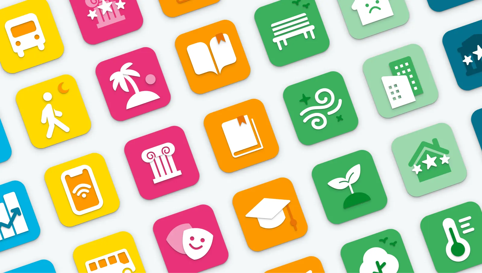
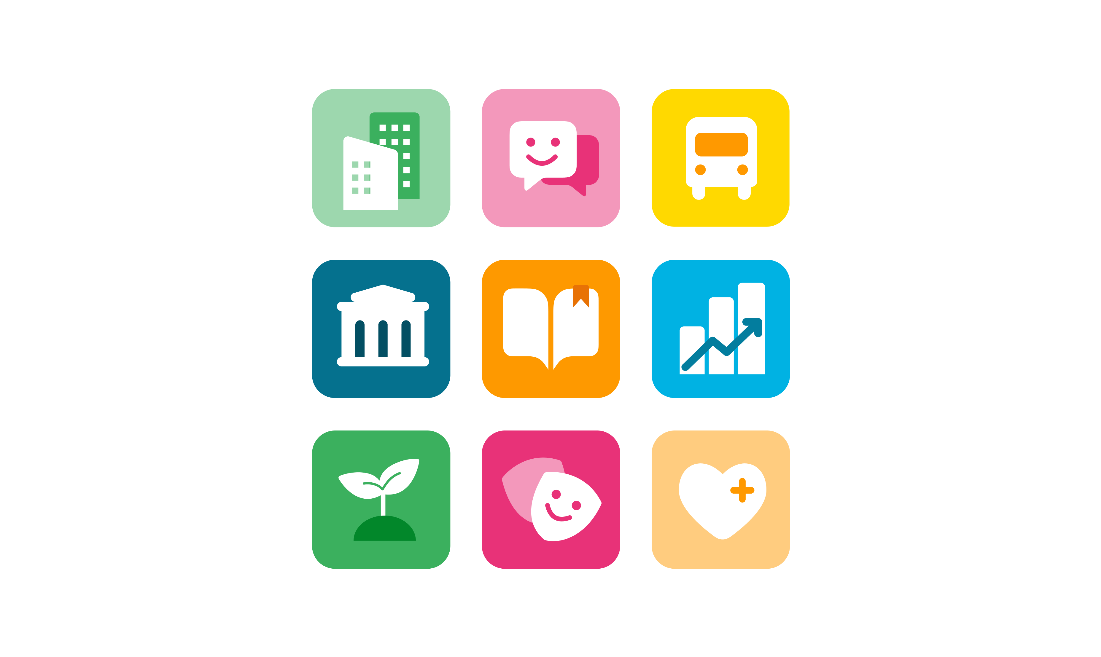
One of my primary responsibilities was redesigning the nine Quality of Life domain icons, which represent the initiative's core categories:
- Housing
- Education
- Health & Wellbeing
- Governance
- Environment
- Culture
- Basic Services & Mobility
- Social Coherence
- Economy
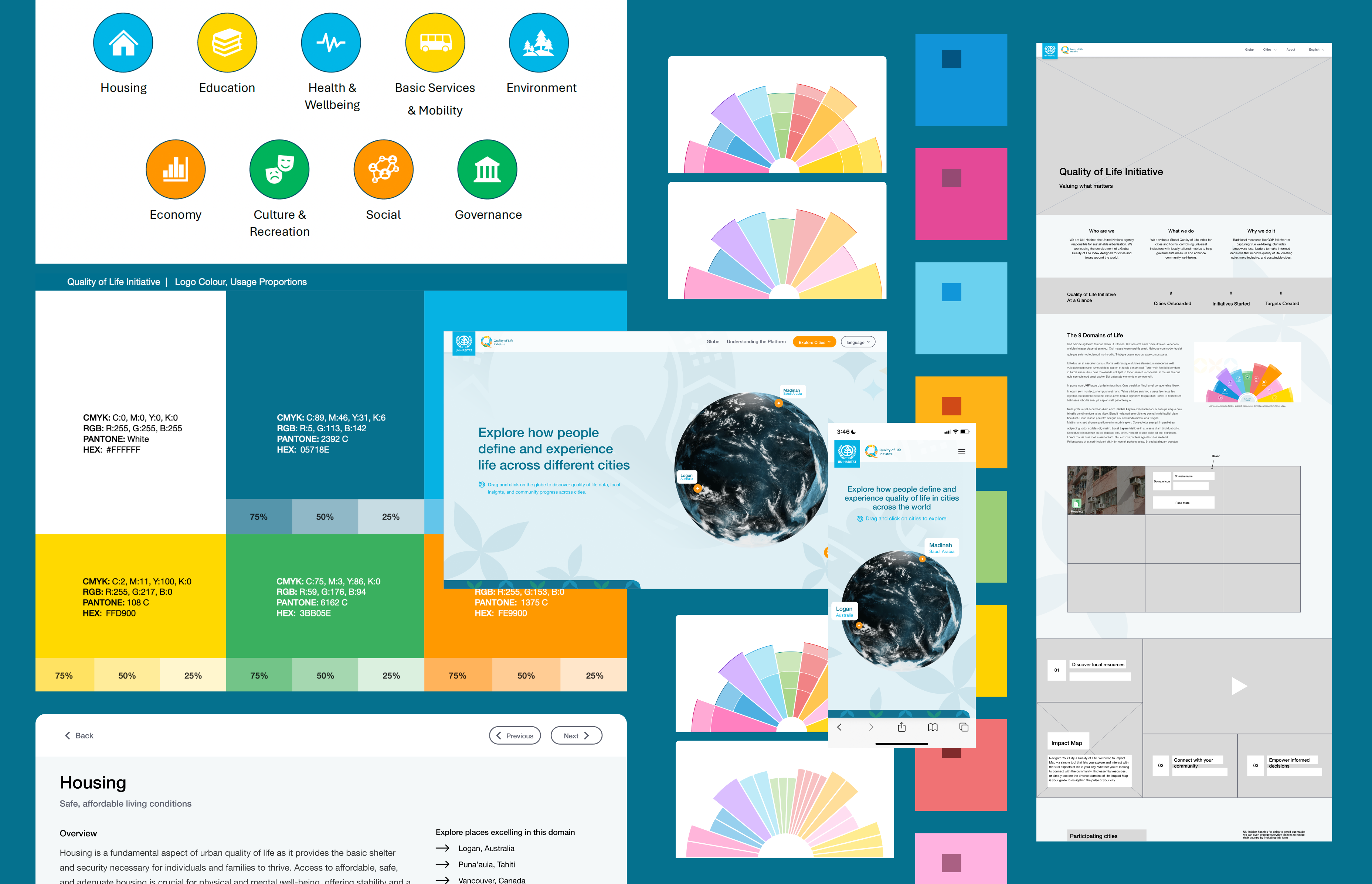
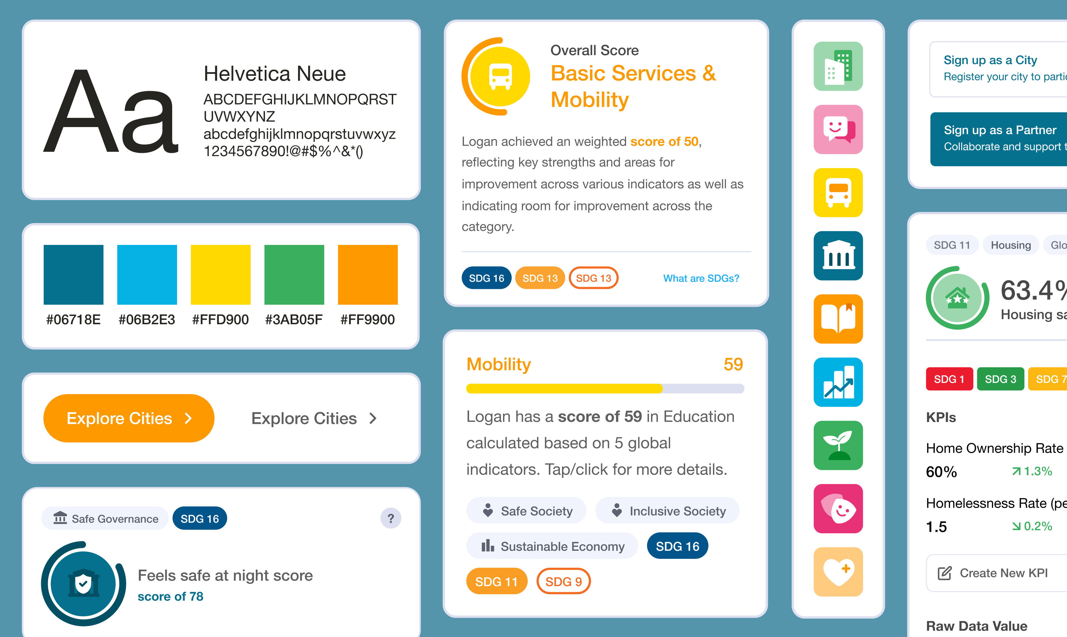
These icons appear throughout the platform, including navigation, dashboards, and data visualizations, making them one of the most frequently used visual elements in the product. I began by auditing the existing branding and iconography, identifying inconsistencies in style, weight, and recognizability. Through sketching and iterative exploration, I developed a new icon set with a consistent visual language that could scale across both digital products and marketing materials. Alongside the icon work, I tested color combinations against WCAG accessibility guidelines to ensure the interface remained readable while staying aligned with the Quality of Life Initiative's visual identity.
Design Decisions
Building consistency into every interaction
Design systems aren't just collections of components. They're tools that help products feel predictable. Throughout the project, I contributed reusable UI components and standardized interaction patterns so similar actions behaved consistently across the platform. This reduced the amount of new interface patterns users needed to learn as they moved between different areas of the product. The redesigned domain icons also played an important usability role. Because they represent the platform's primary categories, users encounter them repeatedly throughout the experience. Designing them as a cohesive family made it easier to recognize sections at a glance and strengthened the platform's overall visual consistency. Together, these decisions created a design system that supported future product growth while making the experience easier to navigate for users.
Results
The design system is now live
Latest Projects